Saturday, September 29

iOS6 has some map-parent problems


Apple's iOS6 released last week alongside the new iPhone 5. iOS6 contains innovative features such as the ability to decline calls with a custom message or callback reminders, a camera upgrade allowing the user to take a panorama photo, upgraded Safari browser capabilities, and so much more. However, the inclusion of the new Apple Maps system has caused some ridicule by users and the online community.

The new system allows you to look at city and street maps, but now it gives you a 3D view of buildings and bridges. This can look gorgeous, as evidenced by this picture:
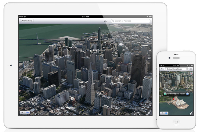


However, the quality of this program is not always as consistent. In some areas, roadways and buildings appear wavy or contain 90 degree angle vertical drops between streets or roads. In this image you can clearly see certain buildings and monuments look like they're melted pieces of clay, causing many to claim iOS Maps has caused "the apocalypse."


The quality of these images has hit the web in a big way, prompting bloggers and websites to post numerous gaffes, inaccuracies, and inadequacies present. theamazingios6maps.tumblr.com is one such website that finds and posts many of these mistakes; top-down versions missing and mislabeling giant landmarks, random discolorations, among others.

The popularity of these blogs and images and how infamously low quality this maps system is compared to the Google Maps service prompted Apple CEO Tim Cook to release a statement to users apologizing for the low quality:

"At Apple, we strive to make world-class products that deliver the best experience possible to our customers. With the launch of our new Maps last week, we fell short on this commitment. We are extremely sorry for the frustration this has caused our customers and we are doing everything we can to make Maps better."

With the release of iOS6 and subsequently the iPhone 5 and the overall success that each are having with users, it doesn't look like this minor hiccup will cause many problems for Apple. However, it does show maybe a little wavering in the confidence and consistency of a Tim Cook-led Apple. 

Friday, September 28

Service With a Smile

Hey everyone,
it's always helpful to be courteous and kind to SMDC patrons; if we create a benevolent and beneficial experience with people who use our services, they will be more likely to come back. Here are some ways we can provide this experience for our customers:

-Communicate clearly(Speaking and Listening) Being intentional when conversing will help  ourselves and our patrons from getting confused or frustrated when solving a problem.

-Be patient. This is very important as we deal with a myriad of different issues with our technology and other concerns our users may have. If we fail to be patient and become frustrated then we are not providing a comfortable or safe environment for our patrons.

-Smile. A smile is a simple way to brighten another person's day. It's easy and usually they will smile back returning the good vibes.

-Give suggestions, educate, and talk about the different resources we have to offer. "Give a man a fish and he will eat for a day, teach a man to fish and he will feed himself for a lifetime" We need to help educate people on how to use their programs instead of always just doing it for them. It will help them along the road in completing different projects and they will benefit from learning new sets of skills.

These are only a few of the many things we can possibly do to create and enriching experience for our users. Do what you can to keep students and faculty coming back to the SMDC for more.

Thursday, September 27

Infographics: Aren't They Just Pie Graphs by Another Name?

Have you ever heard of infographics? No doubt you've seen them. More and more, infographics--a combination of textual information and illustrations--are being used in print and web publications as a more engaging and effective means of portraying stats, data sets, quantifiable relationships, procedures, relational networks...just about anything that would otherwise require a solid paragraph of text (or more) to explain.

We've all seen pie charts, bar graphs, and density maps before, but they often lack the design clarity and aesthetic quality to elevate visualizations of information above board room-level boredom.

So are infographics really all that different? Read on.

Sunday, September 23

Color Correcting with Gels

Ever wonder what those gel sheets in the advanced lighting kits are for?  They help "fix" lights to work with ambient or background light.  Basically, if room lights have a different color (or, more technically, temperature) than the lamps in the kit (such as daylight [more blue] or fluorescent [more green / orange] the gels can adjust the lamps to match. 

You can find out more from this Lowel EDU page:

http://www.lowel.com/edu/light_controls/gels.html 

Smart Board Studio 2

Recently, there have been questions regarding the smart board in Studio 2. Many users have been having trouble using the pen and have came to the desk saying that it won't work and the light on the smart board is red, indicating the pens don't work on it. One solution is to restart the computer (through the first monitor). This will reboot the entire system (computer and smart board) and the pens should be good to go afterwards. The reason seems to be that after a certain amount of time, the computer goes into power-saver mode, disabling the smart board. So, if a user has problems with it, a simple solution is to reboot. Just remember to tell the user to save any work to an external hard drive before restarting.

Wednesday, September 19

National McNair Scholars

One of our very own, Ashley Evans, will be presenting her research at the National McNair Scholars hosted at the University of Delaware on October 11-12.  McNair Scholars from across the nation will present their research, too, and you can read the article in UDaily.

Ashley will also be a participant in the Poetry Slam.  Win the money, Ashley!


The Importance of Using A Backdrop For Photography Purposes


Many beginner photographers overlook the importance of backdrops. It is commonly found that they set up what would have been a stunning photograph and only later discover that a distracting background element was also captured. The photograph may no longer be focused on the intended subject and is therefore ruined.

However, with the availability of the Backdrops at the University’s Student Multimedia Design Center this can be easily avoided! The Student Multimedia Design Center offers Diamond Cloth backdrops in white, black, blue and khaki that can be checked out by students of the University.

By using a simple backdrop, such as the ones offered at The Student Multimedia Design Center, you will be able to isolate the subject of your photograph and create a more professional effect. So, the next time you are planning a photo shoot please stop by The Student Multimedia Design Center for a backdrop and always remember that what you capture behind your subject can make or break your photographs!